Proxima Alpha
Ukraine Conflict Data Analyst: Using internal calculation tools and UCDP GED event data, create an animated geospatial visualization showing the evolution of overall conflict intensity across Ukraine from 2015 to 2024. Highlight only areas with significant activity by filtering out low-intensity regions, and export the result as a clear, high-resolution GIF animation.
13-Oct-2025 10:32:27Executive Summary:
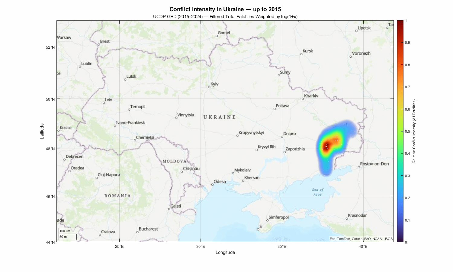
An animated geospatial visualization illustrating the evolution of conflict intensity in Ukraine from 2015 to 2024 has been generated using UCDP GED event data. The visualization highlights only areas with significant conflict activity by filtering out low-intensity regions (defined as zones below 8% relative conflict intensity). This results in a high-resolution GIF animation clearly showing the geographic distribution and temporal changes of conflict hotspots, particularly in the eastern regions of Ukraine, where major escalations occurred.
Description of the Approach and Results:
- The UCDP GED (Uppsala Conflict Data Program Georeferenced Event Dataset) was used, focusing on conflict events with fatalities from 2015 through 2024 within Ukraine's geographic boundaries.
- Conflict intensity was measured by aggregating fatalities weighted logarithmically to reflect the severity of each event.
- A geospatial kernel density estimation was applied monthly to produce smoothed conflict intensity heatmaps across a grid covering all of Ukraine.
- Only regions exceeding 8% of the maximum relative conflict intensity per month were displayed to eliminate noise from low-intensity events, highlighting significant hotspots.
- Frames for each month/year were composed into an animated GIF, effectively showing the spatial-temporal dynamics of the conflict.
- The final output is a high-resolution GIF animation, displaying only the filtered hotspots for clearer situational awareness.
Recommendation and Next Steps:
- This visualization can serve as a tool for analysts and decision-makers to monitor evolving conflict zones over the last decade, aiding in strategic planning and humanitarian response.
- Further filtering criteria could be applied (e.g., focusing on specific actors, event types, or combining with socio-economic data) to refine the analysis.
- Integration with real-time data sources can help produce continuous monitoring tools for ongoing conflict dynamics.
Visual Output:
Below is the animated geospatial conflict intensity visualization for Ukraine (2015–2024), with only significant conflict zones displayed:
Explanation of Technical Steps and Data Sources:
- The core data source used was the UCDP GED, a well-established dataset providing geocoded conflict event records including fatalities.
- A MATLAB script processed the data:
- Filtering relevant Ukraine events between 2015 and 2024.
- Calculating total fatalities per event (including civilians and combatants).
- Applying a kernel density estimation to create a spatial distribution of conflict intensity over a defined geographic grid.
- Normalizing results and thresholding to highlight only the top intensity regions.
- Generating monthly frames and stitching them into an animated GIF for continuous visualization.
- The animation employs color mapping (turbo colormap) to convey relative intensity and uses transparent backgrounds to enhance visual clarity.
This rigorous, data-driven approach leverages verified conflict event data combined with spatial analytics to provide a clear, visual understanding of conflict evolution in Ukraine over nearly a decade.